
Navigating complexity

As a UX/UI Designer, I am faced with these kind of complexities in my daily work. Starting a new project feels like someone placing a 1000-piece puzzle on your desk and taking away the packaging, leaving you uncertain about the final picture. But why is this?
More and more clients ask us to help them navigate their growing digital landscapes. Large organizations often find themselves entangled in complex stakeholder ecosystems, hierarchies, workflows, and systems. We are all human and our brains are not made to work like data analytics platforms. We, therefore, need to make sense of things in order for us to work and innovate.
With the help of intelligent UX/UI design, we are able to make data and systems comprehensible to enhance our clients’ efficiency, improve employee satisfaction, and enable a more human approach to data driven decision making.
So I would love to share my insights on how we managed to solve this puzzle with three simple, yet powerful strategies.
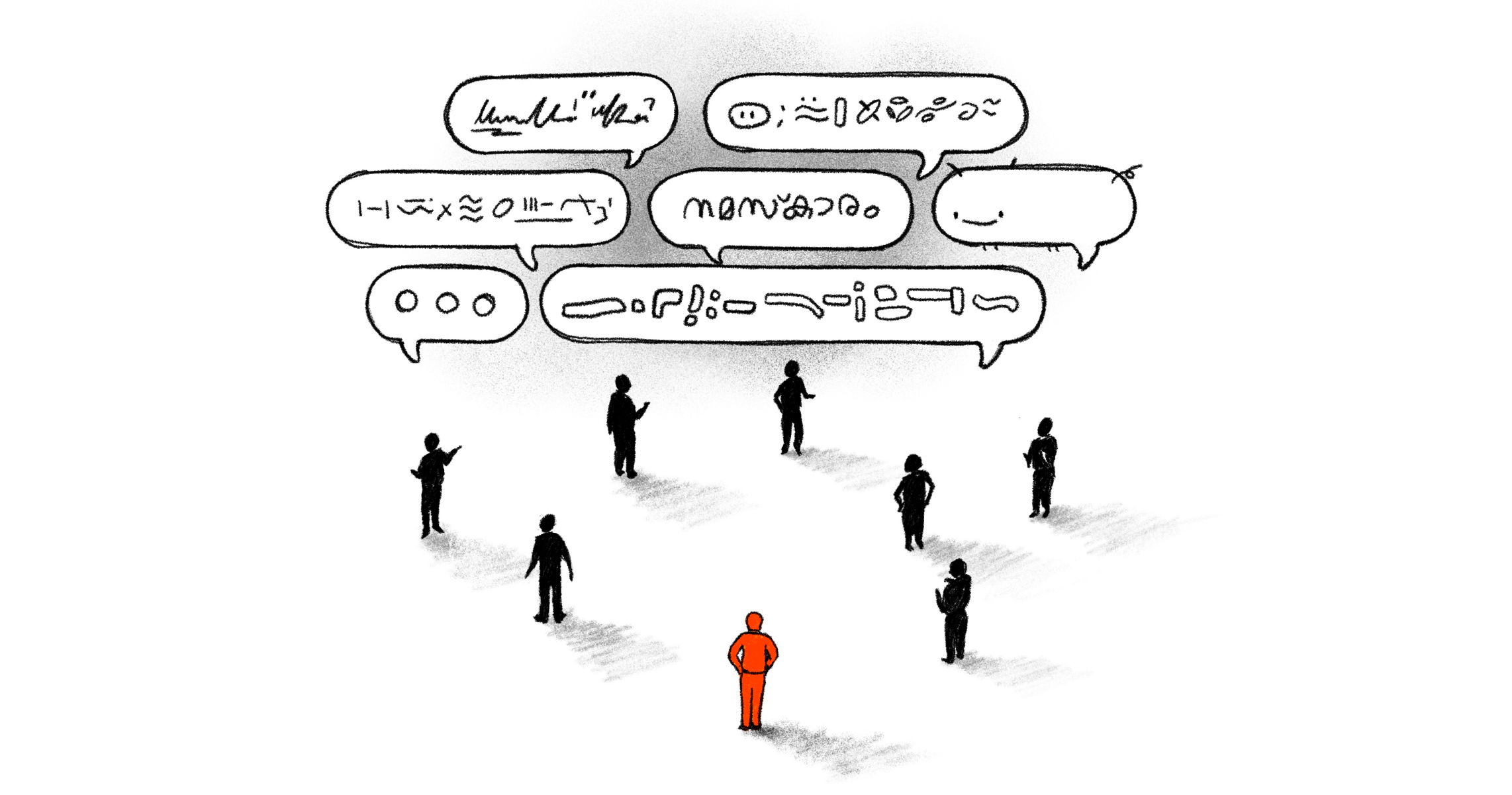
A common language.
As boring as it may sound, communication is the cornerstone of overcoming complexity.
As we immerse ourselves in a client’s universe, it often feels like learning a new language. Big cooperations use abbreviations and very specific terminology that enable but also hinder them in their communication. We experienced that teams do not use language consistently and the question “are we talking about the same thing?” comes up quite frequently. This creates knowledge gaps and blocks collaboration.
Our process of finding a common language:
1. Start a shared glossary with your project team. It can be as simple as a text document.
2. Use simple terms and make it human. Textbook definitions can be overwhelming, so try to enable all members to understand the context.
3. Hold each other accountable to use these terms.
With a better understanding of a topic and its dependencies, a common language contributed immensely on our clients decision making process and collaboration abilities.
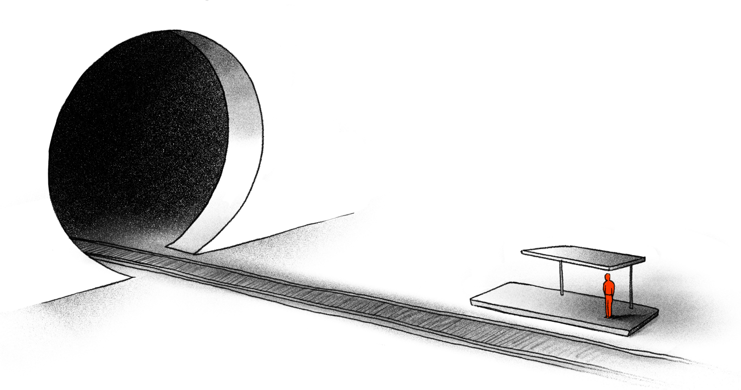
A visual/real life reference.
It’s easier solving a puzzle if you know what the end result should look like.
It takes a lot of mental load to work with digital ecosystems because they are abstract. We learned that technical process charts and slide decks are not really enabling employees to convey their ideas and communicate issues and successes to different stakeholders. Referring to a mental model, a visual or real life reference helps team members align their thinking patterns.
For our client Siemens, we introduced the London Underground map as a visualisation of a customer’s journey from initial inspiration to making a purchasing decision. As transport maps are a known concept, it enabled us to communicate information inside a framework that everybody could read and relate to, no matter their position within the company.
Our process of finding a visual reference:
1. Stick to what you know. Use real life references and scenarios to illustrate complex ecosystems.
2. Test if others feel the same.
3. Don’t be afraid to evolve. It is sometimes hard to let go of an idea if it is already established but the reference should not hold back the process.

Filters to dial down the mental load.
Often, the devil sits in the detail.
After defining out how to communicate and how to visualise our complexities, we were still left with an overwhelming amount of information. Rather than reduce the amount of information, we learned through working with different stakeholders that it is better to define the timing of when a type of information should be surfaced.
With the help of UI design and storytelling, information can be divided into smaller chunks that are comprehensible. During our collaboration with Siemens, the overview of their channels were represented as a universe metaphor, where clicking on one channel — or a planet — revealed more information. Beside zooming in and zooming out, we used filters, hovers, and popups that enabled users to selectively access information. This encouraged individuals to explore pockets of information across the ecosystem at their own pace.
Our process of dialing down the metal load:
1. Define hierarchies and dependencies
2. Find out what is important to your stakeholders and filter information accordingly
3. Make it interactive and encourage self-exploration
Our journey of decoding complexities of organisational landscapes revealed the pivotal role of creating more human ways to incorporate data in our daily working lives. We witnessed how ripple effects can manifest as enhanced efficiency, improved employee satisfaction, data-driven decision-making, and the creation of a more empathetic and emotionally connected environment for both systems and people within.
The most rewarding outcome for me as a designer, was showcasing the project outcomes to a wider stakeholder group at Siemens. Seeing how they could immediately identify with what we created and instantly voice new ideas on how this will impact their role, feels even better then solving the puzzle itself.
Words by Carolin Gläser, visuals by Ashwin Suresh
